Theming the SDK
Customize the appearance of your UI elements to match the look and feel of your app. This step is optional, and if you choose not to customize the theming parameters, the SDK's default values will be used.
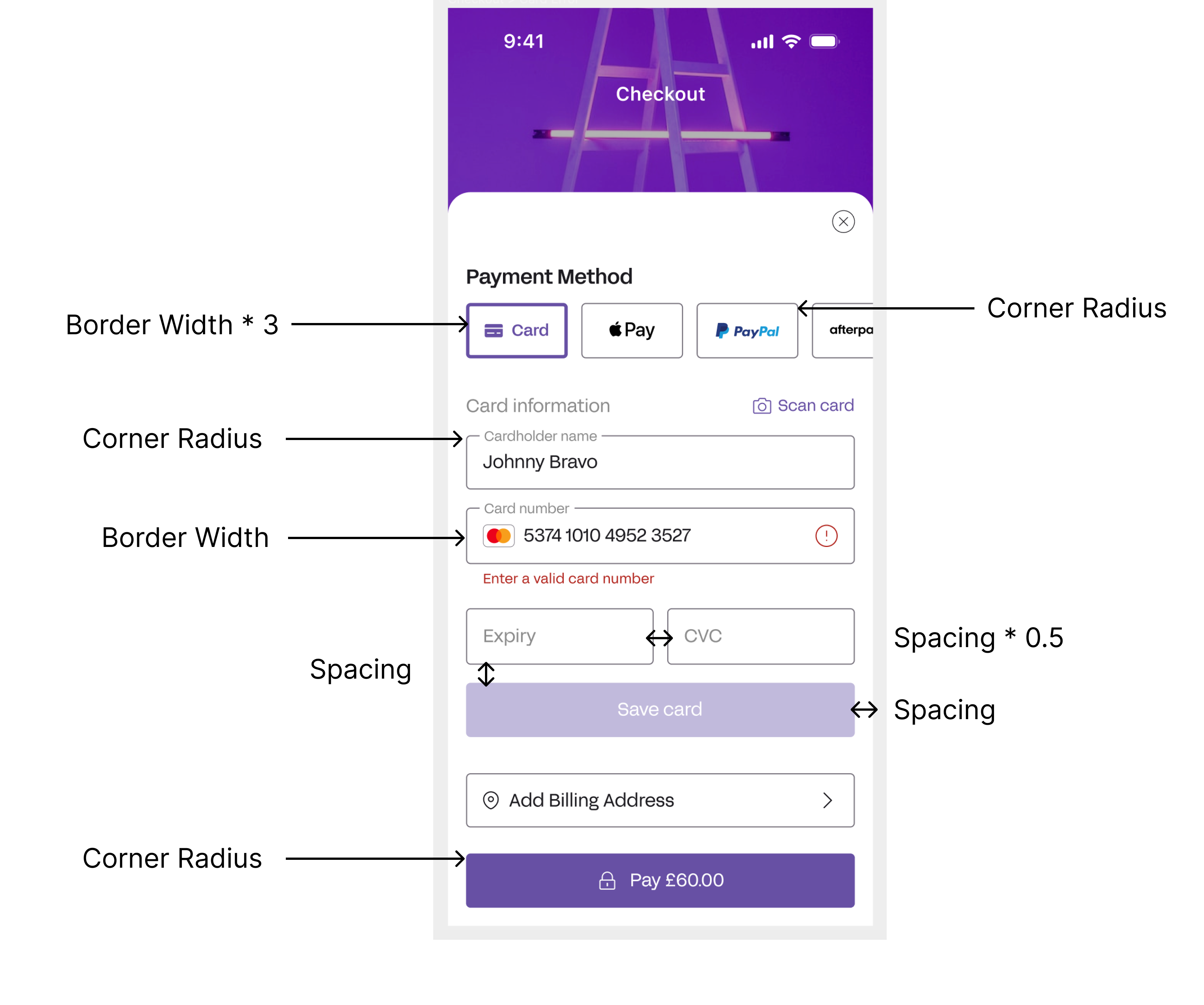
Although the layout of these elements is fixed to remain consistent, you can modify colors, fonts, and other parameters such as corner radius and spacing.
You can specify both the Light and Dark mode themes upfront, and the SDK seamlessly handles switching between the two based on your customer's device settings.
The following image showcases the full capabilities of the MobileSDK's theming parameters. It is meant purely for demonstrative purposes, and is not an offering at this time.

| Colours | Notes |
|---|---|
| primary | The primary brand color used throughout UI Elements (e.g. CTA Button Colour) |
| onPrimary | A color with a high contrast to the primary colour, used for elements that are displayed over a primary colour (e.g. CTA Button text) |
| background | The color used as the background for the sheet that UI elements are presented on |
| text | The default text color used throughout UI elements, appearing over the background color. |
| success | The color used to indicate success (e.g. Valid input) |
| error | The color used to indicate errors or destructive actions (e.g. Invalid input) |
| border | The color used for borders of input fields and tabs |
| placeholder | The color used for input placeholder text |
| Dimensions | Notes |
|---|---|
| cornerRadius | The rounding applied to UI Elements (e.g. Buttons, Text Fields) |
| borderWidth | The thickness of borders of input fields and tabs |
| spacing | The spacing between individual views on UI Elements |
| Other | Notes |
|---|---|
| font | The font family used throughout UI Elements |
iOS
How to Customize the SDK visuals for iOS
Match the look and feel of the SDK to your app using the iOS SDK's visual customization capabilities.
Easily tweak the SDK by passing the optional Theme() object when initializing the SDK. This enables customization of the color scheme for Light and Dark mode, and customization of the font and the dimensions of the elements.
When the Theme() object is not provided, the SDK uses it's default values.
The Theme() component is as follows:
public struct Theme {
    var lightThemeColors: Colors
    var darkThemeColors: Colors
    var dimensions: Dimensions
    var fontName: String
}
Examples of SDK customization for iOS
The following examples showcase how the MobileSDK can be customized:
- The following shows the default for the MobileSDK, and so there is no customization:
let config = MobileSDKConfig(environment: .staging)
MobileSDK.shared.configureMobileSDK(config: config)
- The following example demonstrates how to customize all parameters::
let lightThemeColors = Colors(
    primary: Color.purple,
    onPrimary: Color.white,
    text: Color.black,
    success: Color.green,
    error: Color.red,
    background: Color.white,
    border: Color.gray,
    placeholder: Color.gray)

let darkThemeColors = Colors(
    primary: Color.purple,
    onPrimary: Color.white,
    text: Color.white,
    success: Color.green,
    error: Color.red,
    background: Color.black,
    border: Color.gray,
    placeholder: Color.gray)

let dimensions = Dimensions(
    cornerRadius:  8,
    borderWidth: 1,
    spacing: 20)

let fontName = "Avenir-LightOblique"

let theme = Theme(
    lightThemeColors: lightThemeColors,
    darkThemeColors: darkThemeColors,
    dimensions: dimensions,
    fontName: fontName)

let config = MobileSDKConfig(environment: .staging, theme: theme)
MobileSDK.shared.configureMobileSDK(config: config)
- The following example demonstrates how to customize colors only:
let lightThemeColors = Colors(
    primary: Color.purple,
    onPrimary: Color.white,
    text: Color.black,
    success: Color.green,
    error: Color.red,
    background: Color.white,
    border: Color.gray,
    placeholder: Color.gray)

let darkThemeColors = Colors(
    primary: Color.purple,
    onPrimary: Color.white,
    text: Color.white,
    success: Color.green,
    error: Color.red,
    background: Color.black,
    border: Color.gray,
    placeholder: Color.gray)

let theme = Theme(
    lightThemeColors: lightThemeColors,
    darkThemeColors: darkThemeColors)

let config = MobileSDKConfig(environment: .staging, theme: theme)
MobileSDK.shared.configureMobileSDK(config: config)
- The following demonstrates how to customize the dimensions only:
let dimensions = Dimensions(
    cornerRadius:  8,
    borderWidth: 1,
    spacing: 20)

let theme = Theme(dimensions: dimensions)

let config = MobileSDKConfig(environment: .staging, theme: theme)
MobileSDK.shared.configureMobileSDK(config: config)
- The following demonstrates customizing fonts only:
let fontName = "Avenir-LightOblique"
let theme = Theme(fontName: fontName)
let config = MobileSDKConfig(environment: .staging, theme: theme)
MobileSDK.shared.configureMobileSDK(config: config)
Definitions
MobileSDK.Theme
| Name | Definition | Type |
|---|---|---|
| lightThemeColors | Color theme containing light mode parameters. | MobileSDK.Colors |
| darkThemeColors | Color theme containing dark mode parameters. | MobileSDK.Colors |
| dimensions | The dimension values for various UI elements | MobileSDK.Dimensions |
| fontName | Name of the font to be used within the theme. | Swift.String |
MobileSDK. Colors
| Name | Definition | Type |
|---|---|---|
| primary | The primary color that is displayed over active elements such as buttons, active text fields, dropdown menus etc. | SwiftUI.Color |
| onPrimary | Color used for text and icons displayed on top of primary color. | SwiftUI.Color |
| text | The color that is used for the text that is input into the field by the user. | SwiftUI.Color |
| success | The success color is used to indicate success in components such as text fields, icons, validations etc. | SwiftUI.Color |
| error | The error color is used to indicate error state in components such as textfield for cases when validations fail. | SwiftUI.Color |
| background | This color is used for the background of the widget bottom sheet on which all other components are placed. | SwiftUI.Color |
| border | Used as a color for textfield outline border and separators. | SwiftUI.Color |
| placeholder | Color used for text and icons displayed on the background as well as textfield labels and placeholders. | SwiftUI.Color |
MobileSDK.Dimensions
| Name | Definition | Type |
|---|---|---|
| cornerRadius | The corner radius that is applied to various components such as buttons and text fields. | Swift.Double |
| borderWidth | Width of the borders in the SDK such as text fields in points. This value is for inactive text fields. Active text field double this amount. | Swift.Double |
| spacing | The spacing that is applied to the layout of the SDK. It impacts horizontal and vertical distance from the bottom sheet borders and spacing between the elements. | CoreFoundation.CGFloat |
MobileSDK.Theme.fontName
| Name | Definition | Type |
|---|---|---|
| fontName | Name of the font that will be used across the entire SDK UI. The font needs to be imported as a resource into the project. | Swift.String |
Android
How to Customize the SDK visuals for Android
Note
Customizing the SDK theme, referred to as the MobileSDKTheme, is broken up into 3 parts. Each item is optional and customizable based on what you intend to target and change.
Use the MobileSDKTheme helper functions to create the various theming components used by the SDK. These functions can create the default values, which you can override if you need to make updates. You can also use them to change properties without having to specify every value.
The helper functions follow a similar customisation pattern to Jetpack Compose.
The theming components, as well as the helper method associated with each section, are as follows:
- Colours →
Colours.themeColours()
- Light Mode →
lightThemeColors()- Dark Mode →
darkThemeColors()- Dimensions →
Dimensions.themeDimensions()- Font →
FontName.themeFont()
Examples of SDK customization for Android
The following examples showcase how the MobileSDKTheme can be used and customized. They range from full scope examples to minor, specific theming updates.
// Full Theme Update
MobileSDKTheme(
	colours = MobileSDKTheme.Colours.themeColours(
		light = MobileSDKTheme.Colours.lightThemeColors(
			primary = Color.Blue,
			onPrimary = Color.White,
			text = Color.Black,
			placeholder = Color.Gray,
			success = Color.Green,
			error = Color.Red,
			background = Color.White,
			outline = Color.DarkGray,
		),
		dark = MobileSDKTheme.Colours.darkThemeColors(
			primary = Color.Blue,
			onPrimary = Color.White,
			text = Color.White,
			placeholder = Color.LightGray,
			success = Color.Green,
			error = Color.Red,
			background = Color.Black,
			outline = Color.Gray,
		),
	),
	dimensions = MobileSDKTheme.Dimensions.themeDimensions(
		cornerRadius = 4,
		shadow = 0,
		borderWidth = 1,
		spacing = 10
	),
	font = MobileSDKTheme.FontName.themeFont(
		fonts = listOf(AppFont)
	)
)

// Only Updating Colour Scheme
MobileSDKTheme(
	colours = MobileSDKTheme.Colours.themeColours(
		light = MobileSDKTheme.Colours.lightThemeColors(
			primary = Color.Blue,
			onPrimary = Color.White,
			text = Color.Black,
			placeholder = Color.Gray,
			success = Color.Green,
			error = Color.Red,
			background = Color.White,
			outline = Color.DarkGray,
		),
		dark = MobileSDKTheme.Colours.darkThemeColors(
			primary = Color.Blue,
			onPrimary = Color.White,
			text = Color.White,
			placeholder = Color.LightGray,
			success = Color.Green,
			error = Color.Red,
			background = Color.Black,
			outline = Color.Gray,
		),
		// using default SDK dimensions
		// using default SDK font family
	)
)

// Only Updating Dimensions
MobileSDKTheme(
	// using default SDK colour scheme
	dimensions = MobileSDKTheme.Dimensions.themeDimensions(
		cornerRadius = 4,
		shadow = 0,
		borderWidth = 1,
		spacing = 10
	)
	// using default SDK font family
)

// Only Updating Font
MobileSDKTheme(
	// using default SDK colour scheme
	// using default SDK dimensions
	font = MobileSDKTheme.FontName.themeFont(
		fonts = listOf(AppFont)
	)
)
This can further be expanded by only updating certain properties within a specific section. For example, only changing the primary colour of the MobileSDKTheme:
MobileSDKTheme(
	colours = MobileSDKTheme.Colours.themeColours(
		light = MobileSDKTheme.Colours.lightThemeColors(
			primary = Color.Blue
		),
		dark = MobileSDKTheme.Colours.darkThemeColors(
			primary = Color.Blue
		)
	)
)
Note
This must be added/applied using the MobileSDK → MobileSDK.Builder...applyTheme(updatedTheme)
Definitions
com.paydock.MobileSDKTheme
| Name | Definition | Type |
|---|---|---|
| colours | The colour theme containing light and dark mode | com.paydock.ThemeColors |
| dimensions | The dimension values for various UI elements | com.paydock.ThemeDimensions |
| font | The font theme containing the font family to be used within the theme | com.paydock.ThemeFont |
com.paydock.ThemeColors
| Name | Definition | Type |
|---|---|---|
| light | The colour theme containing light mode | com.paydock.ThemeColor |
| dark | The colour theme containing dark mode | com.paydock.ThemeColor |
com.paydock.ThemeColor
| Name | Definition | Type | Compose Link |
|---|---|---|---|
| primary | The primary colour is the colour displayed most frequently across your app’s screens and components. | androidx.compose.ui.graphics.Color | Theme.primary |
| onPrimary | Color used for text and icons displayed on top of the primary color. | androidx.compose.ui.graphics.Color | Theme.onPrimary |
| text | The colour (and state variants) that can be used for content on top of surface. | androidx.compose.ui.graphics.Color | Theme.onSurface |
| placeholder | Color used for text and icons displayed on top of the background colour as well as text field labels and placeholder text. | androidx.compose.ui.graphics.Color | Theme.onBackground |
| success | The success colour is used to indicate success in component, such as valid text in a text field. | androidx.compose.ui.graphics.Color | n/a |
| error | The error colour is used to indicate errors in components, such as invalid text in a text field. | androidx.compose.ui.graphics.Color | Theme.error |
| background | The background colour is used for sheet that UI elements are presented on | androidx.compose.ui.graphics.Color | Theme.surface |
| outline | Subtle colour used for boundaries. Outline colour role adds contrast for accessibility purposes. | androidx.compose.ui.graphics.Color | Theme.outline |
com.paydock.ThemeDimensions
| Name | Definition | Type |
|---|---|---|
| cornerRadius | The corner radius applied to shapes used by buttons, cards and certain backgrounds. | androidx.compose.ui.unit.Dp |
| shadow | The shadow that can be applied to provide elevation to components | androidx.compose.ui.unit.Dp |
| borderWidth | The border width is the width applied as stroke width to container borders, outline buttons. | androidx.compose.ui.unit.Dp |
| spacing | The spacing applied to content, specifically columns and rows and acts as a divider between content. | androidx.compose.ui.unit.Dp |
com.paydock.ThemeFont
| Name | Definition | Type |
|---|---|---|
| familyName | The font family name that is applied to all text based components. This is used within compose to easily be converted to the required type. | androidx.compose.ui.text.font.FontFamily |